159 sites
across every industry we've built for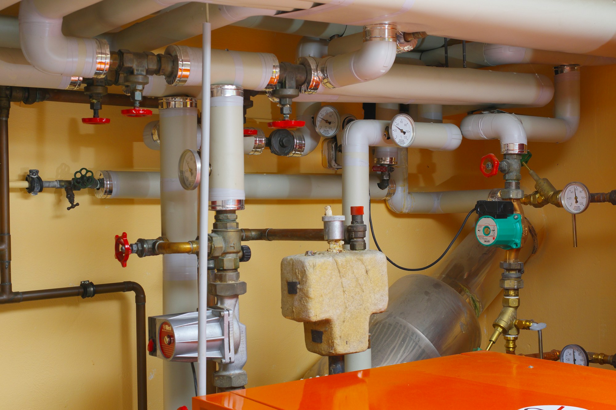
Apex Plumbing & Heating
Family-run plumbing & heating engineers. Bold trades-trust design, big phone CTA, navy & electric blue palette — everything pointing toward booking the call.
Stone & Timber Builders
Family-run builder doing extensions, renovations and new builds. Industrial confident look — black hero, full-bleed worksite imagery, safety-yellow accents.
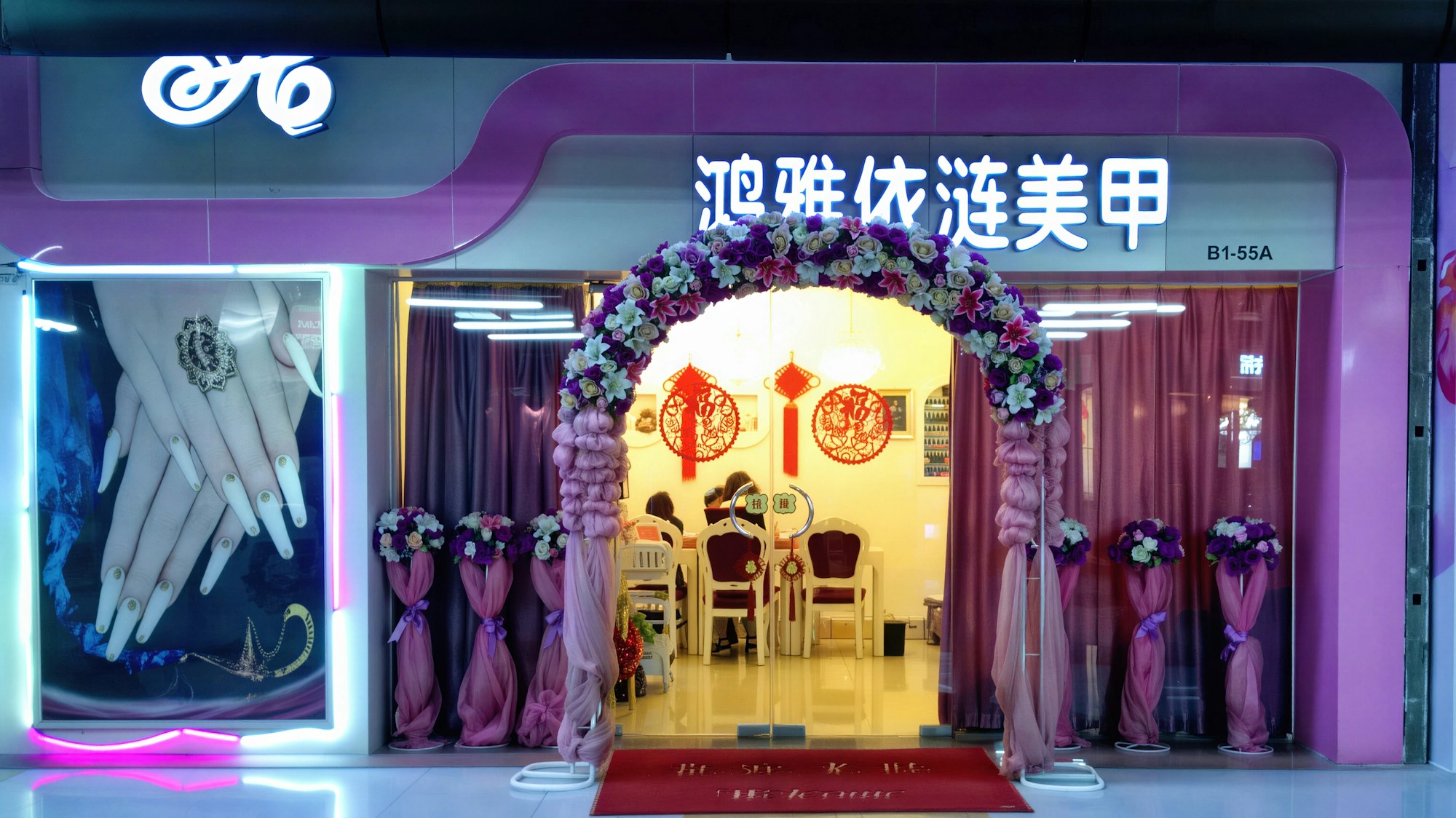
Lacquer Nail Studio
Six-chair boutique nail studio. Soft pink & cream palette, Playfair italic, considered nail care imagery — appointment-only positioning.

Move Better PT
1:1 strength & movement coaching. Warm photographic, terracotta + cream — anti-bro positioning for busy professionals who want to feel less broken.
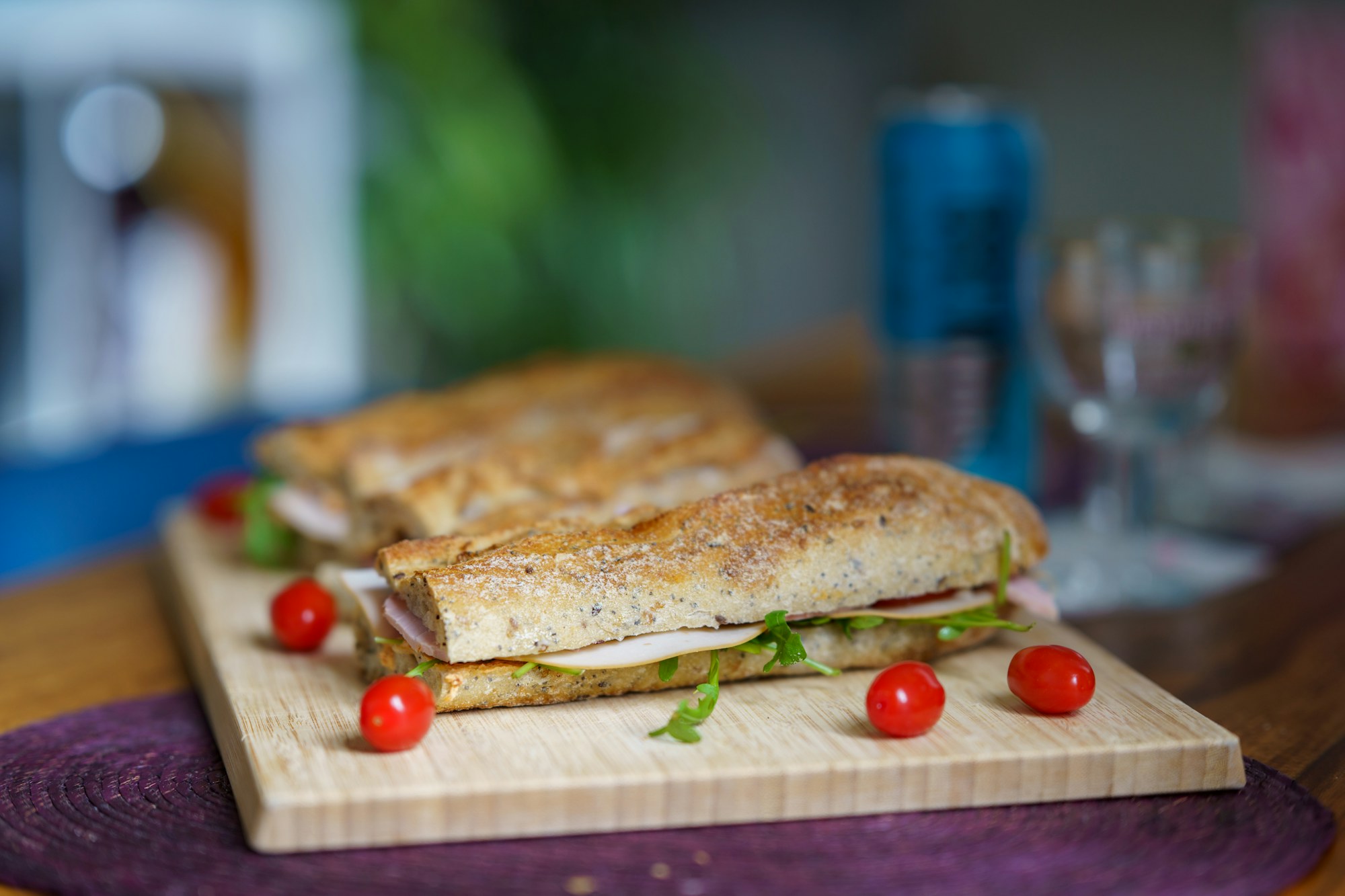
Crumb & Co.
Independent sandwich shop. Mustard + cream palette, hand-drawn typography, fun and food-forward — a six-item menu done properly.
Wren & Oak
A bespoke joinery studio specialising in fitted furniture for considered British homes. Editorial typography, warm cream palette, masonry portfolio.
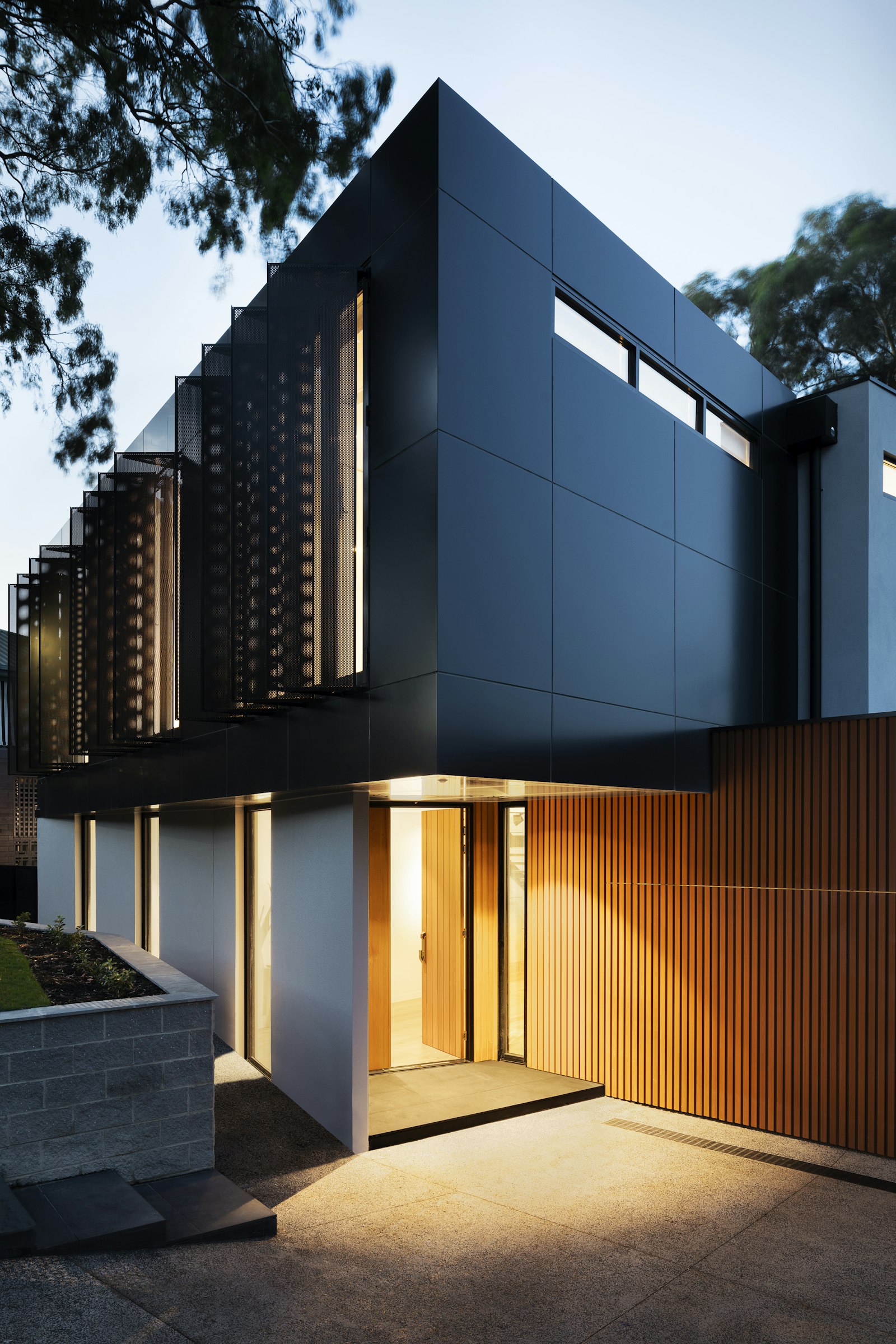
Atelier
A small London architecture studio working on private homes, cultural buildings, and considered commercial projects. Brutalist minimalism, sharp grid, monochrome.
The Larder & Stone
A 22-cover modern British restaurant with an open kitchen on Bristol's King Street. Moody serif, deep forest green, candle-lit photography, daily-changing tasting menu.
FORGE
Boutique S&C gym in Manchester's Northern Quarter. Bold display typography, electric orange accent, programme-led membership and 1:1 coaching.
Heath & Bramble
Garden design practice working across the Cotswolds and Home Counties. Soft serif, sage green & cream palette, English country planting.
The Cotswold House
A 12-room boutique country hotel restored over four years. Warm cream palette, classic Cormorant serif, editorial layout for a small luxury brand.

Marlowe & Stone
Documentary wedding photography studio. Soft cream backdrop, Playfair Display serif, romantic editorial layout focused on portfolio and storytelling.
Petal & Stem
Considered floral studio for everyday and wedding work. Soft pink & cream palette, italic Cormorant, romantic-but-modern feel.

Whitfield & Sons
Three-generation Savile Row tailor. Deep navy & cream palette, classic Cormorant Garamond, heritage editorial feel built around craft and lineage.
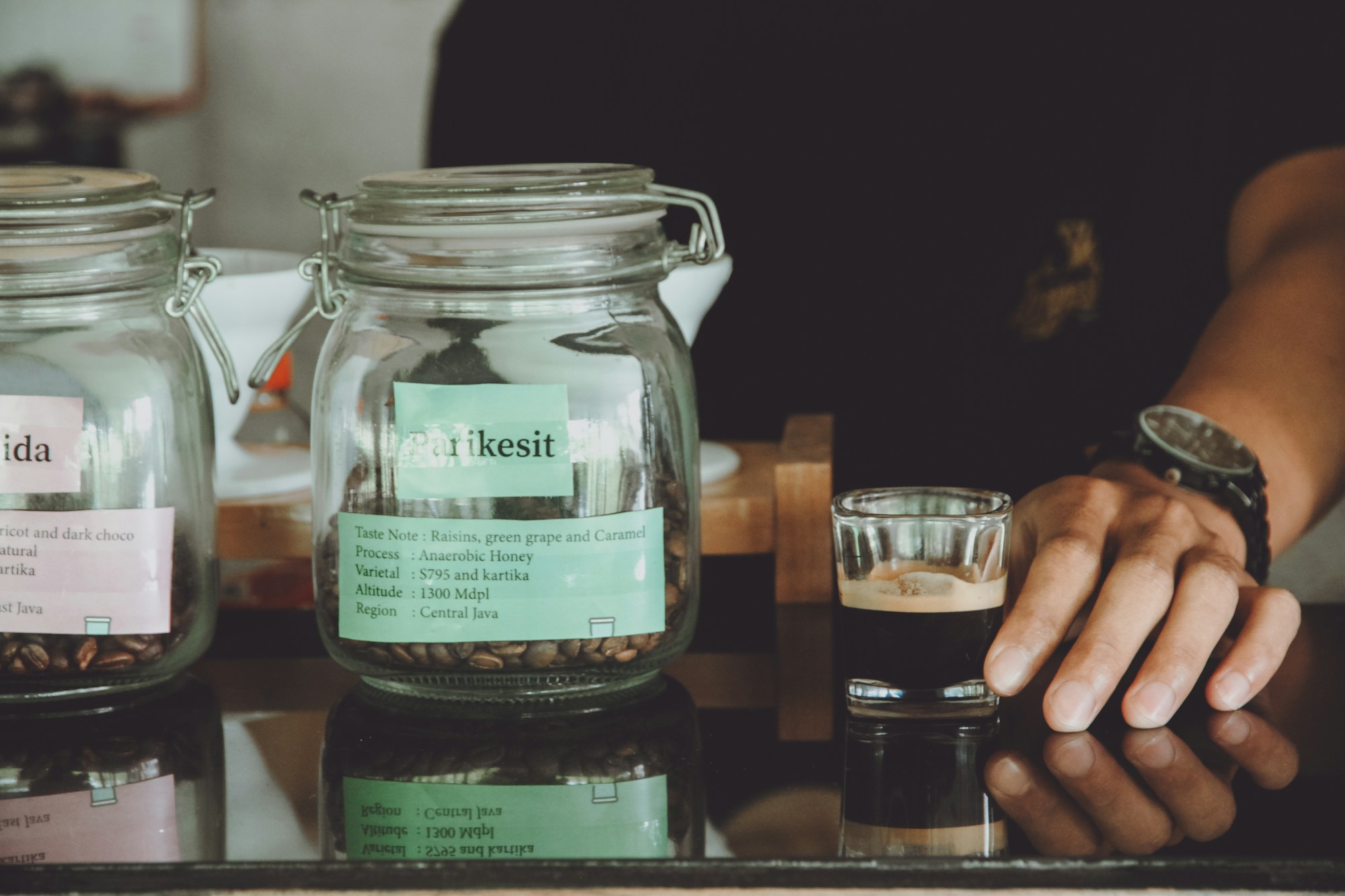
Threshold Coffee
Single-origin specialty roaster + café. Warm white + terracotta accent, Space Grotesk typography, modern-craft hybrid for a young coffee brand.
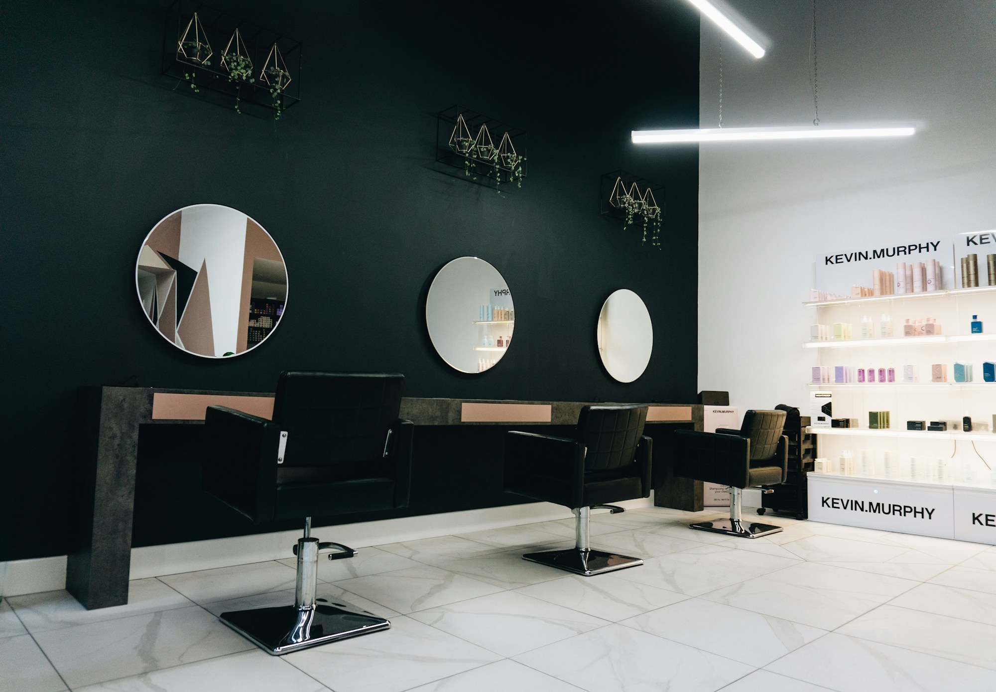
THE EDGE
Six-chair high-end salon. Bold monochrome with red accent, Bebas Neue display typography, fashion-forward and unapologetic in tone.
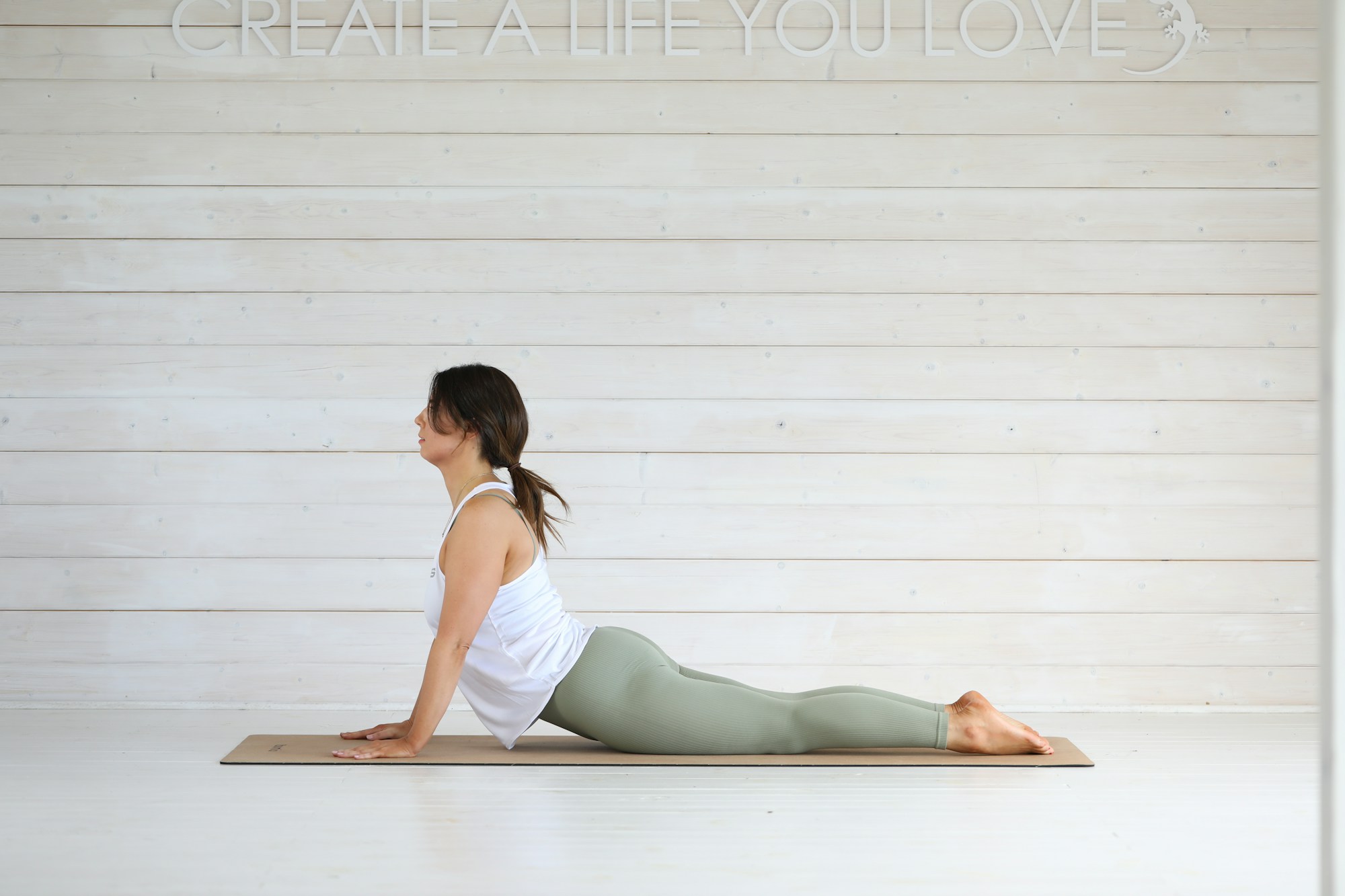
Stillness
Small yoga studio for serious practitioners. Warm beige + rust palette, Lora serif, calm and considered without being saccharine.
Heatherton Property
Independent country estate agent. Slate blue + cream + gold accent, refined Cormorant typography, premium feel for high-value country property sales.
Studio Noir
Boutique brand & identity studio. Pure black & white, Space Grotesk + Inter, hyperminimalist editorial for a meta-design brand.
The Birch Bakery
Artisan sourdough + viennoiserie bakery. Warm cream + brown + butter yellow, Fraunces serif, food-forward warm editorial feel.

Compass & Co.
Bespoke travel design studio for considered journeys. Navy + cream + gold palette, DM Serif Display, vintage-map premium feel.

Alpine Veterinary
Independent family vet practice. Sage green + cream + warm orange, Lora + DM Sans typography, friendly and reassuring without being cutesy.

Voltline Electrical
Asymmetric trade-bold design with sulphur yellow + jet black + hazard-tape motifs. NICEIC-registered sparky with sticky-bottom mobile call CTA, Anton condensed display type.

Reach Roofing & Loft
Cinematic charcoal-on-parchment trades layout with amber accents and condensed Oswald display type. 90vh hero with bottom-anchored headline, vertical 3:4 portrait service cards, sticky mobile call bar.
Forge & Hammer Mechanics
Heritage workshop retro: oil-black canvas with chrome silver borders, signal-red accents, rotated polaroid hero, hazard-tape stripe dividers, service-counter ticket cards with monospace rate badges. Slab-serif and mono numerals.
Greenfields Removals
Trustworthy family-trade design built around a split hero — full-bleed van photo on the left, cream side on the right with serif headline and a working quote-widget. Brass numerals on a 4-step 'How it works' timeline, curved teal route line through Manchester landmarks.
Stargazer Driving School
Bold playful driving school in sunset orange + indigo + custard yellow. Stacked Outfit Black hero with rotated yellow '87% first-time pass' badge, instructor card strip with Grade A pills, pricing-tier-style courses grid, sparkle motifs on indigo about.

Clearwater Cleaning Co.
B2B SaaS-modular landing for a commercial cleaning company. Sky-blue + mint + charcoal palette on white, icon-led 6-service grid, 3-tier pricing block with highlighted 'Most booked' card, before/after gallery and trusted-by logo row.
The Crown & Anchor
Traditional pub editorial in burgundy + cream + ale-gold with Cormorant serif headlines. Brass-tacked chalkboard hero, dotted-leader menu, 12-tap ale list on wood-grain section, six dog-friendly room cards from £140/night.
Saffron House
Cultural food-led ornate design in aubergine + saffron + ivory. SVG corner motifs framing the hero, geometric dividers between menu categories, dotted-line British family-restaurant pricing, dramatic full-bleed tandoor feature.
The Hide & Hatch
Heritage farm-craft for a family butcher in the Dales. Maroon + cream + butcher-paper buff palette with Roboto Slab headlines, inline woodcut SVG illustrations of cow/pig/lamb, hand-pinned 'This Week's Cuts' board with dashed dividers and tidy price columns.

Foster & Roach
Editorial compassionate-premium family law site in soft sage + warm cream + dusty rose. Paragraph-led editorial typography (no icon cards), three sepia-toned partner portraits, transparent fee table, italicised 'When To Call Us' list. Female-led, quietly British.

Northbrook Accountancy
Modern fintech-grotesque accountancy site in deep navy + lime. CSS-only animated dashboard hero, three transparent pricing tiers, 6-service icon grid, 'Why Northbrook' columns with oversize lime mono numerals. Feels like a B2B SaaS, not a stuffy firm.
Cedar Vision
Fashion-clinical modernist site for a Cheltenham optician. Pure-white canvas with jet-black ultra-thin headlines and warm sage + blush + gold accents. The visual anchor: a 4-column 'frames wall' grid of 12 indie-brand frames (Cubitts, Lindberg, Anne et Valentin, Mykita) priced £195-£395.
Craftwood Carpentry
Workshop-craft design for a Norfolk carpenter — walnut and sawdust cream palette with a yellow carpenter-pencil accent. Roboto Slab headlines, a 'job sheet' table for services, ruler/measuring-tape graphic with rotating 'Measure Twice / Cut Once' marquee.

Brushstroke Painters & Decorators
Family-run painters in pastel paint-chip cream with rose, sage and ochre accents. Fraunces editorial serif over a 'Colour of the Month' swatch motif — distinct from any other trades site.
Tile Lab
Magazine-style portfolio for a two-person tiling studio. Full-bleed luxury bathroom hero, mixed-weight grotesque type, portrait grid of finished projects, diagonal before/after slider and a CSS tile-pattern divider.

Stone & Mortar Masonry
Third-generation stonemasons working in local Bath stone and lime mortar. Heritage editorial with Roman numerals, a 'Stone of the West' section on local limestone, and chisel-tooling SVG dividers.

Clearview Glaziers
Bright sky-blue + sunny-yellow trades site. FENSA-registered glaziers — double glazing, sash restoration, bi-fold doors. Yellow circular FENSA badge, CSS bar chart comparing U-values before/after.
All Clear Pest Control
Bold alert/urgent design for BPCA-registered pest control. Red diagonal stripe + 24/7 EMERGENCY pulse badge, 6-card 'Common signs' grid, 3-step Survey → Treat → Prevent process, unmarked-van trust signal.

Forge Locksmiths
Industrial charcoal + amber locksmith — MLA-approved 24/7 response. Inter Black + JetBrains Mono badges for response times ('25 MIN'), tumbler-corner service tiles, brass mechanical cog/key divider, mobile sticky call CTA.

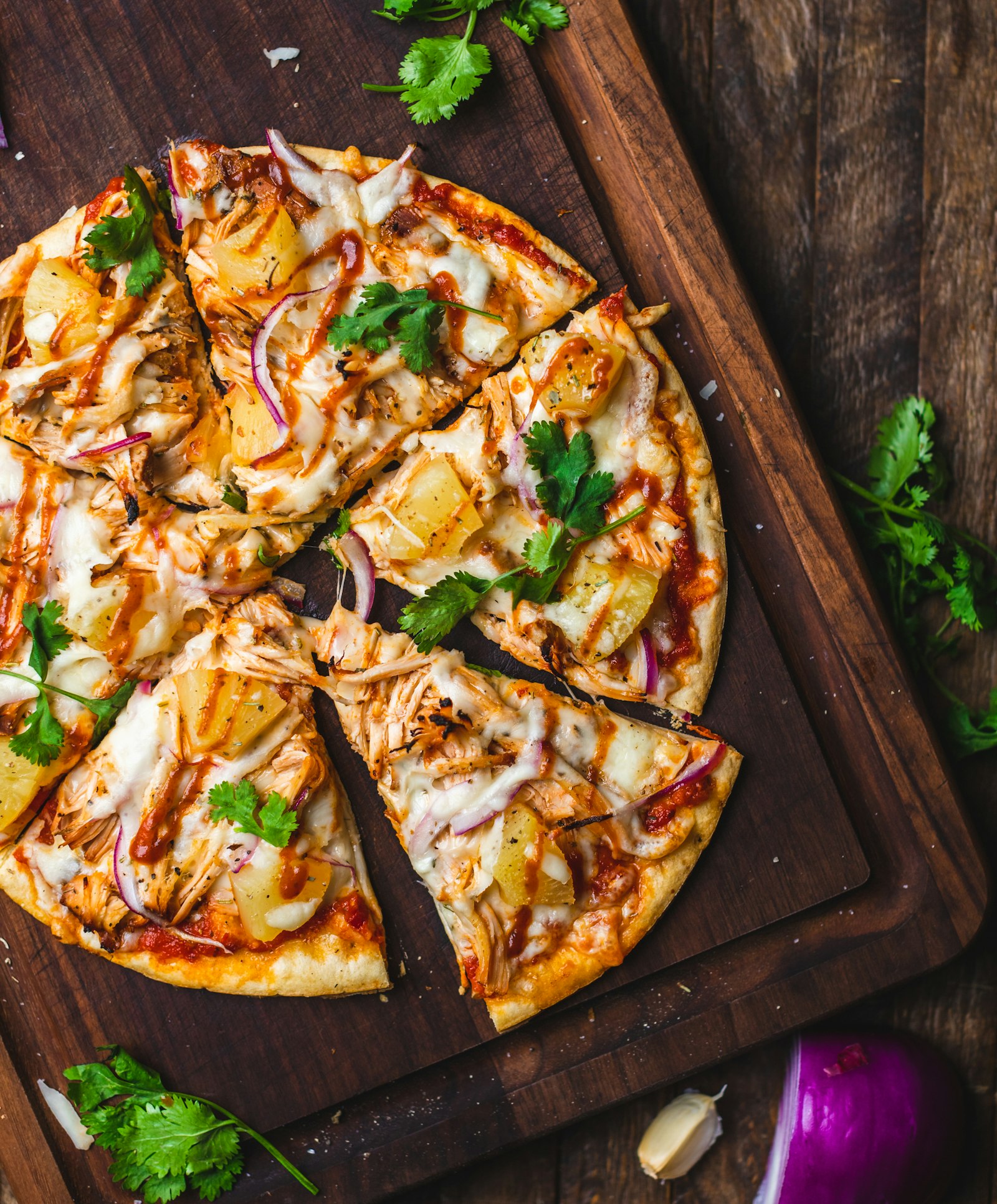
Bella Roma Pizzeria
Wood-fired Neapolitan pizza by a three-generation Naples family. Rustic tomato + basil + cream palette with Cormorant serif, dotted-leader menu with red price columns, full-bleed 'Il Forno' editorial section.
Pho Hanoi
Family kitchen on Frith Street serving Hanoi-style phở. Bold grotesque display + italic 'Phở' brand mark, big orange 'Today's Broth' callout, SVG steam wisps, 16-hour broth + hand-pulled noodle hero.
Bramble
Honest plant-based café — all-day brunch, sourdough toasties, house-made oat milk. Sage + earth tones + cream with Fraunces serif + Caveat cursive flourishes, hand-drawn pressed-flower SVG dividers, supplier farm cards.
Anvil Brewery & Taproom
Independent craft brewery under a Victorian railway arch. Industrial iron + amber + hop green palette, Bebas Neue display + JetBrains Mono ABV/IBU stats, '12 TAPS TODAY' board with style chips and brewer's notes.
Cellar Eight
Sommelier-led wine bar — eight wines by the glass, eighty by the bottle. Burgundy + parchment editorial with Cormorant serif and Courier mono vintage years, atmospheric dark hero, 'Tonight's Eight' I–VIII list with italic tasting notes.
Fleur Patisserie
Hand-rolled French viennoiserie + bespoke cakes by a Cordon Bleu-trained chef. Pastel pink + cream + rose gold palette, Cormorant italic display, 'Today's bake' 4-card showcase with gold-foil gradient frame borders, wedding cake editorial feature.
Albert's Fish & Chips
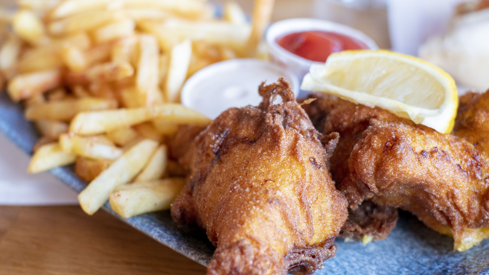
Family chippy since 1972 — three generations, Times Best Chippies 2023, MSC certified. Sign-painter chippy-blue + mustard palette with Anton display, LED-style chip-shop menu board, 'Today's Catch' live strip with pulsing dot.
Rollin'
Hot-pink Korean street-food truck — bulgogi tacos and kimchi loaded fries rolling across the South-East. Bold Outfit display, weekly schedule grid with live pulse dots, vegan options daily, private hire CTA.

Knot & Blade Barbers
Traditional barber shop with four master barbers, hot towels and cut-throat shaves. Pitch black + blood red + ivory + warm gold palette, Source Serif Pro headlines, Roman numeral services, ledger-style price list.
Bloom Beauty Salon
Considered lashes, brows and facials. HD Brows-approved stylist + Elemis-trained facialist. Blush + cream + rose gold + aubergine, Playfair italic display, floral motif dividers, 24/7 online booking.

Quiet Hands
Sports and deep tissue massage in Bath and Bristol — mobile or clinic, ten years' practice. Calm dusty lavender + sage palette, Lora serif, 'what people come in with' issue grid (desk shoulders, runner's hips).

Black Iris Tattoo Studio
Three-chair custom tattoo studio — three resident artists covering fine-line, botanical and black-work. Pitch black + bone white + blood red + neon green callouts, sharp display + mono for booking statuses.
Lucent Aesthetics Clinic
Premium clinical site for a nurse-led aesthetics clinic — Botox, filler, peels, polynucleotides. Clinical white + blush + rose gold + sage, 'Why a nurse, not a beautician' trust section, transparent pricing table.
Centre Line Pilates
APPI-trained Reformer Pilates studio, max six per class. Mint + cream + terracotta palette, Outfit display with mixed-weight contrast, free intro mat class, 4-week beginner Foundations Course.
North Park Garage
Independent Wakefield garage — Class 4 & 7 MOTs, servicing, brakes, tyres. Practical garage-blue + safety-yellow palette with Anton stenciled headlines, MOT FROM £45 rotated badge, mechanic cards with bay numbers.
Sparkle Window Cleaning
Subscription-style reach-and-wash window cleaning — sign once, set and forget. Bright sky-blue + sun-yellow + mint palette, Manrope headlines, six-weekly pricing tiers, calendar visual showing the round.

Canopy Tree Surgeons
NPTC-qualified arborists across the Surrey Hills. Forest-green + bark-brown + sky-blue palette, Roboto Slab headlines, tree-ring concentric SVG dividers, 24/7 storm response callout strip.
Fresh Loom Carpet & Upholstery
NCCA-member carpet cleaning across Reading. Deep teal + coral palette, before/after gallery with overlay labels, 'What we remove' trust grid (pet stains/wine/coffee/mould), end-of-tenancy specialist.
Acorn Nursery & Pre-School
Ofsted Outstanding nursery with forest school sessions. Warm childhood palette — forest green + butter yellow + soft pink on cream. Hand-drawn tree/leaf SVG dividers, dashed-line 'typical day' timeline.
Sage & Stem Tutoring
Oxbridge-educated tutors for KS1–A-Level + 11+ prep. Editorial academic palette — burgundy + cream + sage + navy. Cormorant Garamond headlines, Roman numeral tier cards, 2024 GCSE results table on navy.

Pawsome Pet Grooming
Independent dog grooming salon + mobile-to-home service. Fear-free certified, City & Guilds Level 3, no-muzzle policy. Warm yellow + sky blue + brown palette, before-after pet gallery, calming-process explainer.

Willowfield Wedding Barn
Romantic rustic editorial for a stone-barn wedding venue. Warm cream + sage + brass palette with italic Cormorant display, full-bleed dusk hero with string lights, 'day in pictures' editorial gallery, transparent three-tier pricing.
Cove Holiday Cottages
Five family-run self-catering cottages above Polzeath Bay — 5 minutes to surf, hot tubs in three, direct-booking 18% saving vs Airbnb. Coastal sea-blue + sand cream + terracotta palette with DM Serif Display.
The Garden Gate B&B
Four-room B&B on the Welsh border — Aga-cooked breakfasts, walled garden, log fire. Cozy palette of soft pink + cream + sage + walnut, four individually-named room cards from £95, walking routes from the door.
Birch & Brass Catering
Modern British wedding + event caterer. Tatler-recommended. Cream + deep forest + brass + blush palette with Cormorant serif, plated-canapé hero, 4-step Brief → Tasting → Plan → Service process.
Wildwood Glamping
Three handbuilt treehouses + six bell tents in 40 acres of Welsh woodland. Wood-fired hot tubs, off-grid solar, Visit Wales Gold. Forest green + cedar brown + moss + cream palette, Fraunces serif, illustrated SVG site map.
Drift Surf School
Family-run Cornish surf school — ISA accredited, BSA instructors, RNLI partnership. Coastal energetic palette — ocean blue + sand cream + sunset coral, Outfit display + Caveat cursive 'stoke' accents, live conditions widget.

Hazel & Hopper Photography
Honest family pictures — newborn-at-home, maternity and family documentary. MPA member, 8 years in. Cream + dusty rose + sage palette, italic Cormorant headlines, 10-tile masonry gallery, 3 pricing tiers from £180.

Gilt Frame & Print
Bespoke picture framing + giclée fine art printing. Fine Art Trade Guild workshop, 15+ years. Cream + gold leaf + deep slate + blush palette with DM Serif Display + mono prices, 12-swatch CSS frame profile grid.
Hollow & Stone
Independent jeweller and bespoke workshop on Hatton Garden — engagement rings drawn, cast and set by hand on-site, by private appointment. Goldsmiths' Company members, ethical sourcing, lab-grown options.

Heartwood Furniture Co.
Bench workshop making sideboards, dining tables, bookcase walls and bespoke kitchens from English + European hardwoods. Hand-cut joinery, 50-year structural guarantee, traceable timber.

Margin
Literary independent bookshop with curated 6,000 titles, in-store coffee bar, monthly author events. Forest green + cream + brick red palette, classic serif headlines, 'this month's staff picks' grid.

Ink & Ribbon
Hand-cranked letterpress wedding invitations + small-batch stationery. Ivory + indigo + gold leaf + rose palette, Cormorant display with italic edition-number accents, 8-stock paper library, 4-step process.
Cornerstone Dental Practice
Friendly Solihull family dental practice — NHS + private care, three regular dentists, evening + Saturday appointments. Clinical white + teal + sage palette, Manrope grotesque, NHS-vs-private pricing transparency table.

Resolve Physiotherapy
Chartered sports + MSK physiotherapy clinic in Nottingham with Premier League experience. ACL rehab, post-surgical recovery, running gait analysis, shockwave. Lime green + navy palette, recovery timeline visual.
Realign Chiropractic
Calm-clinical Harrogate chiropractic practice — adult adjustments, pregnancy + paediatric care, McTimoney low-force. Earth brown + soft sage palette, 'Who we help' condition grid, treatment-vs-painkiller comparison.

Trent & Vale Mortgages
FCA-authorised whole-of-market mortgage broker for first-time buyers, remortgages and self-employed clients. Navy + gold palette, serif headlines with italic gold accents, live rate-tracker mockup, fixed-fee transparency.

Crown Wealth Advisory
Chartered Financial Planner — fee-only, independent, FCA regulated. Premium wealth editorial in deep teal + cream + antique gold palette, Cormorant Garamond + mono fee figures, FCA disclaimer baked in.

Little Star Toys
Independent toy shop since 2012 — wooden toys, STEM kits, books, outdoor play. Plan Toys, Grimm's, Connetix. Primary red + sunshine yellow + sky blue palette, Quicksand display, 4-tab 'Shop by age', birthday gift quiz.
Hearth
Curated independent homeware shop on Catherine Hill, Frome — 30+ small British makers across ceramics, linen, beeswax candles, botanical prints. Warm cream + sage + terracotta palette with Fraunces serif.
Magpie Antiques
Heritage antique dealer on Long Melford High Street — Georgian furniture, mid-century modern, silver, vintage jewellery. LAPADA member, established 1998. Maroon + parchment + brass with Cormorant serif italic descriptions.
Aria Bridal Boutique
Designer wedding dresses — eight stocked designers from £1,500–£5,000. Bridal Buyer member, est. 2015, 5★ across 300+ reviews. Champagne + cream + blush palette with Cormorant italic display, private-suite appointments.

Verdant
Indoor jungle in Peckham Rye — 250+ houseplant varieties, statement greenery, pots and planters. Forest green + cream + terracotta palette, Fraunces serif, 8-card plant catalogue with light/care guide, free Saturday workshops.
Lime & Skim Plasterers
Two-person plastering crew — skim, render, lime work on heritage walls. Workshop-craft layout in dust-cream + slate + ochre, photographic before-and-after rooms and a tidy day-rate ladder.
The Old Brickwork Co.
Heritage bricklaying and lime-mortar repointing across York's older streets. Burnt-orange + warm cream editorial palette with Cormorant headlines, slip-pattern dividers and a project-led photo grid.

The Boiler Doctor
Gas Safe boiler specialists — same-day repairs, fixed-fee services, finance on installations. Calm clinical-blue palette with green status badges and a clear price ladder.
Cool Cube Air Con
Domestic and commercial air-con installs and servicing across London. Cool ice-blue and chrome with bold sans display, a comparison table for unit sizes and energy ratings, and finance options.

Helios Solar
MCS-certified solar PV and battery installations across the South West. Sun-yellow + sky palette, kWh savings calculator visual, panel + battery package cards with finance options.
Granite Drives & Patios
Resin-bound, block-paved and natural-stone driveways across Surrey. Slate grey + warm gravel cream, full-bleed completed-driveway hero gallery and a transparent per-m² price ladder.
Glasshouse Conservatories
Bespoke conservatories, orangeries and garden rooms — designed in-house, fitted by our team. FENSA-registered, 10-year guarantee. Sage + warm cream editorial with garden-room photography and finance options.

Dry Walls Damp Proofing
PCA-certified damp specialists — rising damp, penetrating damp, basement tanking. Honest charcoal + amber with a 'how damp shows up' diagnostic grid and 20-year guarantee on remedial work.

Drain Squad
24/7 emergency drain clearance, CCTV surveys and lining repairs. Hi-vis yellow + signal red urgent palette, response-time SLA badges and a same-day call-out promise.
Pickets & Posts Fencing
Family fencers across Kent — closeboard, picket, palisade, automated gates. Warm timber-brown editorial with garden hero shots and a clear per-metre price ladder.
Warmfloor UK
Wet and electric underfloor heating systems, retrofit + new build. Warm amber and dark navy palette, system comparison cards and an honest install-fee ladder by room size.

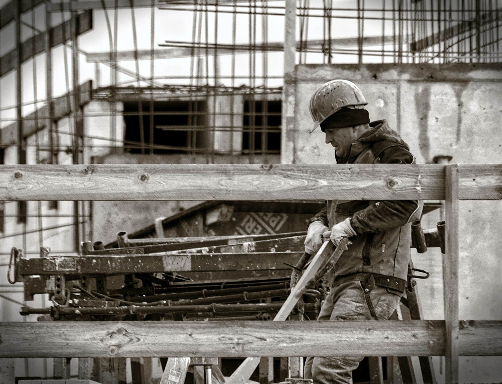
Tower Scaffolding
CISRS-trained scaffolders for domestic, commercial and emergency jobs across Essex. Industrial galvanised-grey + safety-yellow palette with a 24/7 emergency strip and a kit-and-rate transparency table.

Steam Burger Co.
Pink-neon smash-burger shop — steam-grilled patties, brioche, special sauce. Hot pink + signal yellow + jet black palette with Outfit Black display and a five-burger lineup.
Maki Bar
Twelve-seat sushi counter — omakase by reservation, à la carte at lunch. Quiet ink + indigo + pale rice editorial with itamae portrait, daily-changing fish board and dotted-leader price list.
Bangkok Heat
Family-run Thai street kitchen — chargrilled, fiery, properly hot. Deep purple + chilli red + lime palette with Anton display, heat-rating chillis next to each dish and a weekly specials board.
El Tigre Taqueria
Tacos al pastor, micheladas and frozen margs in cobalt-tile heaven. Cobalt blue + sun yellow + chilli red palette with stencil display, full-bleed taco grid and BYO frozen pitcher CTA.
Aegean Plate
Whitewashed Greek taverna on the seafront — meze, charcoal-grilled fish and house-made tzatziki. Aegean blue + warm cream + olive palette with Cormorant headlines and dotted-leader sharing menus.
Yolk
Brunch — done loud. Pancake stacks, eggs every way, lemonades on tap. Sunny yellow + cream + soft pink palette with bold rounded display and a 4-card breakfast menu hero.
Gelato Vero
Hand-churned Sicilian-style gelato — 24 flavours daily, all made in-shop. Pastel pistachio + raspberry + cream palette with Fraunces editorial display and a glass-counter flavour-of-the-day grid.

Cacao & Co.
Bean-to-bar chocolatier — single-origin tablets, hand-rolled truffles and tasting flights. Dark cocoa + warm gold + cream palette with editorial serif and a 4-tier subscription box.

Velvet Hour
Speakeasy cocktail bar — booth seating, hand-stamped menus, no phones at the bar. Deep burgundy + dim brass + cream palette with Cormorant display and a numbered house-cocktail list.
Glen & Juniper Distillery
Small-batch Highland gin distillery — botanical-led, copper-stilled, tour-bookable. Forest green + copper + cream editorial with botanical illustrations, 4-bottle range cards and tour booking.
Forge Box
Functional fitness box — chalk dust, barbells and a strong community. Industrial concrete + signal yellow + chalk white palette with Anton display, weekly programming and intro packages.
Boulder Hall
Indoor bouldering with 200+ problems, set every week. Bold primary palette — climbing reds, blues and yellows on dark concrete — with route-grade chips and intro session packages.
Five Needles Acupuncture
British Acupuncture Council-registered clinic. Calm sage + warm cream + soft amber palette with Lora serif, condition-led 'what we treat' editorial and a clear session-pricing ladder.
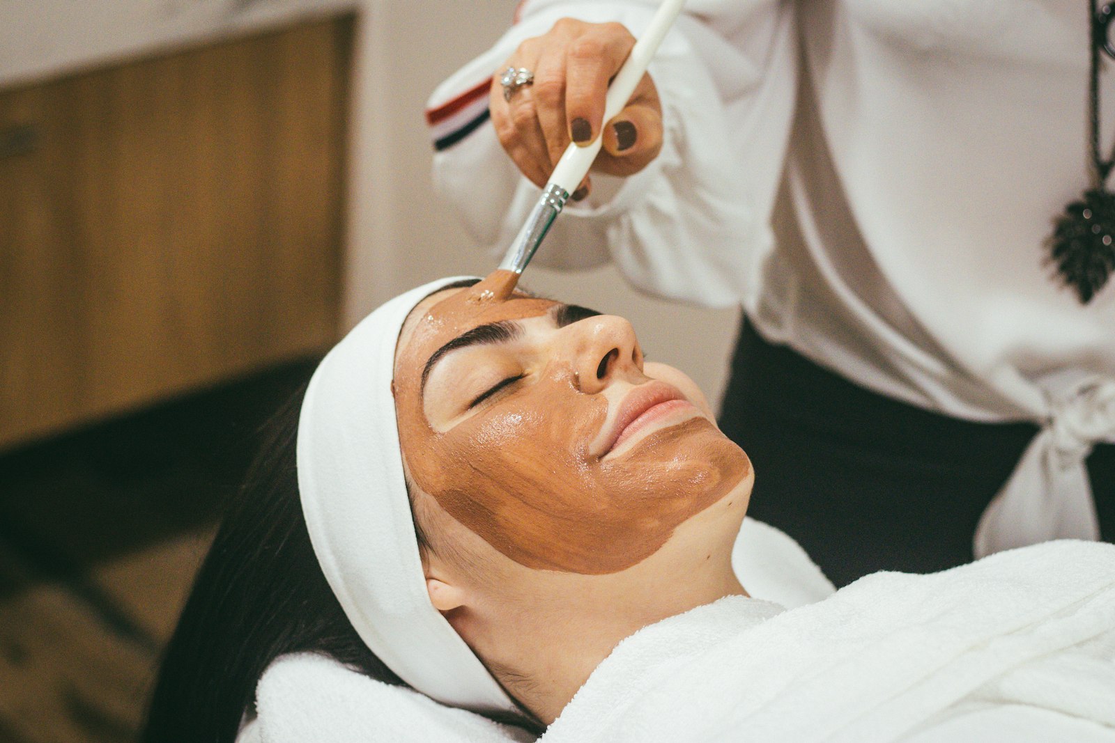
Skinfolio
Medical-grade skincare and facials — peels, microneedling, LED. Pale rose + warm cream + sage palette with Cormorant italic and a four-tier facial menu with transparent prices.
Oak & Iron Mens Spa
Members' grooming room — hot towel shaves, facials, scalp care. Deep walnut + brass + cream palette with editorial serif, a heritage shop interior and four-tier membership cards.
Plate Method Nutrition
Registered Nutritionist (AfN) — fat loss, hormone health, gut. No fads. Calm sage + cream + terracotta palette, plate-method illustration and a transparent three-package ladder.
Inferno Hot Yoga
Heated vinyasa, hot 26 and yin in a purpose-built studio. Hot orange + deep maroon + cream palette with bold display and a weekly timetable.
Iron Jab Boxing Club
Olympic-style boxing, padwork, conditioning. England Boxing affiliated coaches. Industrial concrete + signal red + chalk palette with Anton display and class-led timetable.
Serene Day Spa
Full-day spa with thermal suite, massage rooms and a champagne lunch. Cream + sage + rose-gold palette with Cormorant display, three-tier day packages and treatment menu.

Knot & Vow Wedding Planning
Full-service wedding planner — venue, suppliers, day-of coordination. Warm cream + sage + brass editorial with italic Cormorant display, three-tier planning packages and case-study weddings.

Polish & Co. Mobile Valeting
Mobile car valeting and ceramic coating — we come to you. Glossy ink + chrome + signal blue palette with bold rounded display, three-tier valet packages and a vehicle-size price ladder.
Big Bin Skip Hire
Skip hire across the Midlands — same-day delivery, 90% recycled, no permit fuss. Signal yellow + jet black + cream palette with Anton display, skip-size selector and area coverage map.
Tidy Homes Cleaning
Weekly, fortnightly and one-off house cleans — vetted, insured, regular cleaners. Sky-blue + mint + cream palette, simple hour-based pricing and a service-area postcode list.
Hot Tub Heaven
Hot tub hire for weekends and weeks, plus sales of plug-and-play models. Warm teal + amber + cream palette with playful display, weekend hire packages and a delivery-area calculator.
Pocket Repair
While-you-wait phone, tablet and laptop repairs — screens, batteries, water damage. Bright blue + signal yellow + ink palette, transparent repair-time and price grid by device.
Lockbox Self Storage
Clean, dry, secure self storage — units from 10–200 sqft with 24/7 drive-up access, CCTV and free move-in van. SSA UK member, no deposit, established 2014.

Northern IT
Newcastle's independent computer-repair shop since 2013 — laptops, Macs and small-business IT. No-fix-no-fee diagnostics, fixed prices, same-day workshop repairs.

VanDan Removals
Dan-and-the-van service covering Edinburgh — small moves, IKEA pickups, junk runs. £60/hr, no booking fee, same-day available, £2m insured.
Green Mow
Surrey lawn-care site with weekly/fortnightly mowing tiers, a 4-step seasonal treatment programme, hedge trimming and tidy-ups. BALI member, fully insured, eco-electric mowers.
Cedar Lodge Spa Hotel
A 32-room country spa hotel above Ambleside with indoor and outdoor pools, an AA-rosette kitchen, eight signature spa treatments, and eighteen acres of cedar woodland.

Sunny Pines Holiday Park
Family-run holiday park on the Norfolk coast — pine lodges, touring pitches, on-site pool and beach access. Bright family palette with playful display and a clear week-by-week pricing grid.
Solent Yacht Charter
RYA-coded charter fleet from Cowes — three yachts, two crews, one coastline. Navy + warm-gold editorial with itinerary cards, skipper bios and day-rate specs per boat.

Table for Eight
Private chef for dinner parties, holiday villas and small celebrations. Warm cream + forest + brass palette with editorial serif, three-tier menu packages and a sample tasting menu.
Knife & Flame Cooking School
Hands-on day classes and four-week courses — knife skills, pasta, breadmaking, fish butchery. Warm cream + chilli red + ink palette with Outfit display and a class calendar.
Stillpoint Yoga Retreat
Weekend and week-long yoga retreats on the Pembrokeshire coast — vinyasa, yin, vegetarian kitchen. Sage + warm cream + dusty rose palette, retreat calendar and full-board pricing.
Clay & Kiln Pottery
Wheel and handbuilding classes for adults plus a small shop of one-off pieces. Warm terracotta + cream + ink palette with editorial serif, class calendar and gallery of resident-maker pieces.
Furnace & Breath
RCA-trained glass blower in Stourbridge's old glass quarter. Decorative vases, lighting commissions and tableware drawn from a 1100° furnace by hand.

Tanner & Bridle
A small Northampton leather workshop hand-stitching wallets, belts, holdalls and bespoke commissions from English bridle hide — saddle-stitched, edge-burnished, lifetime repair offer.

Foxed Pages
Hand bookbinder and restorer on Walton Street, Jericho. Family bibles restored, bespoke notebooks hand-stitched, and small-group Saturday workshops. Society of Bookbinders member.

Mainspring Watch Co.
Independent watchmaker and pre-owned dealer on Hatton Garden. Vintage service, sympathetic restoration, bespoke commissions and independent valuations — at the bench, since 2003.
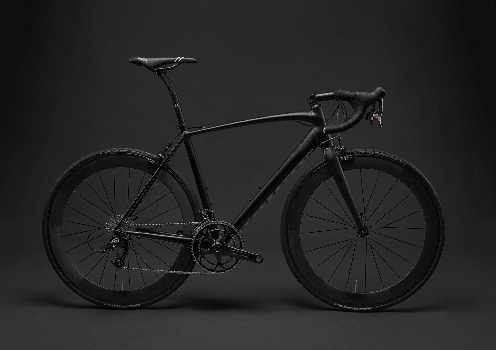
Spoke & Steel
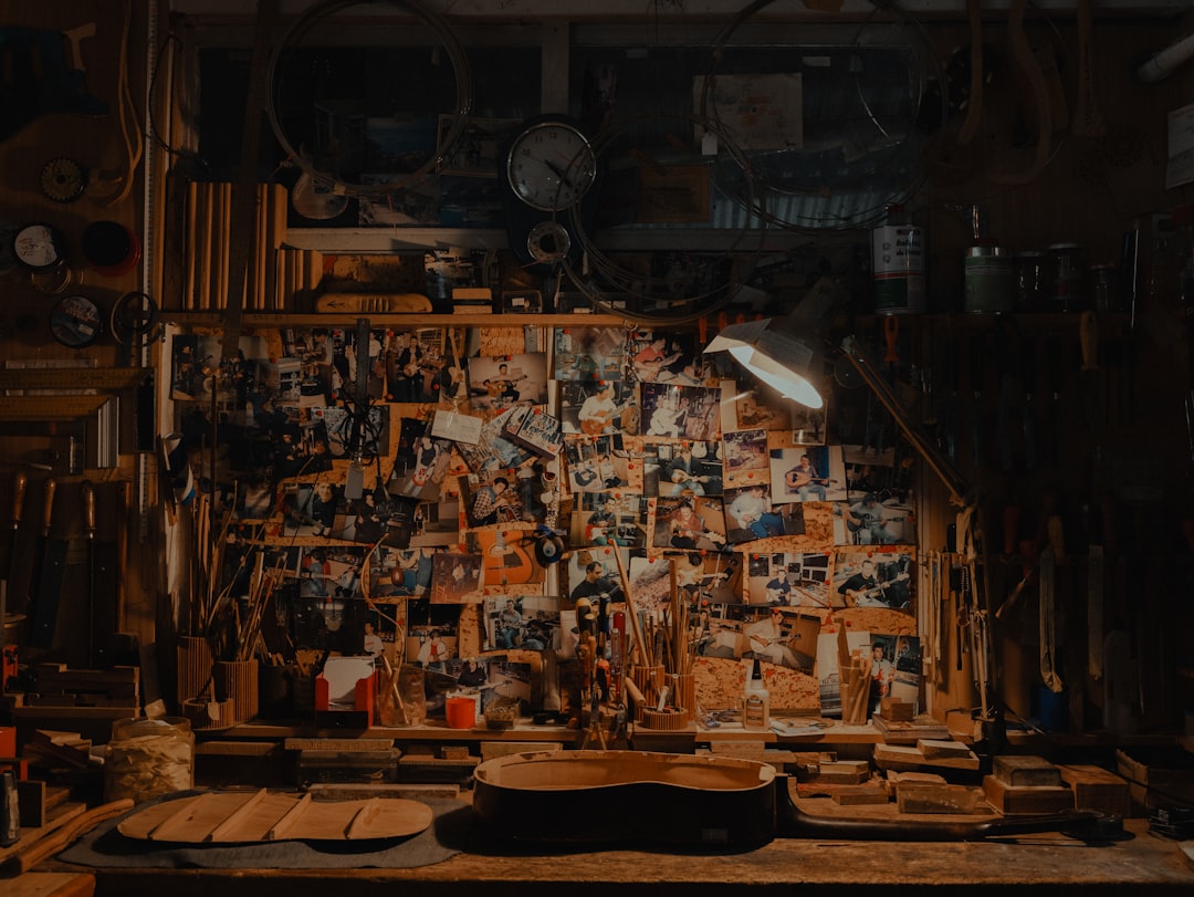
Bristol framebuilders making bespoke steel road, gravel, touring and townie bikes. 20 years on the jig, Reynolds and Columbus tubing, in-person fitting, 5-year warranty.
Saint & Lead
Heritage stained glass studio in York — church window restoration, bespoke domestic panels, and small-group workshops. BSMGP member, York Minster trained.
Driftwood Surfboards
One-shaper workshop in Newquay building custom surfboards to order — longboards, mid-lengths, twin-fins and wooden hollow builds. 25 years on the rack, made to order in 4–6 weeks.

Quill & Vow
Wedding calligrapher and letterer in Bath. Hand-addressed envelopes, place cards, menus, signs and bespoke prints — twelve years at the desk, thirty inks on the shelf.
Plume & Pin
Bespoke Mayfair milliner hand-blocking hats and headpieces for weddings, Royal Ascot and private commission. Trained at Stephen Jones, member of the Royal Milliners' Society.

Drift & Deed Solicitors
Modern Bristol conveyancing solicitors handling 200+ moves a year. SRA regulated, CQS accredited, fixed-fee quotes from £795 for sales and purchases. Plain English, online tracker.
Holst Commercial Law
Premium Manchester commercial law firm for SMEs — five ex-Magic Circle partners, plain English drafting, fixed-fee transparency. Commercial contracts, M&A, employment, IP and disputes.

Last Word Wills & Probate
Plain English wills, probate and Lasting Powers of Attorney from a STEP-qualified Cheltenham practice. Fixed fees, home visits, signed in one sitting.

Numbers Right Tax Advisors
London CIOT chartered tax advisers handling self-assessment returns from £199, HMRC investigations, CIS contractor refunds, landlord and property tax, R&D credits and CGT.

Compass Career Coaching
Premium 1:1 career and executive coaching in Bloomsbury. ICF-PCC certified, twelve years' experience, money-back guarantee on session one. Five clearly-priced packages.
Quiet Mind Therapy
BACP-accredited psychotherapy practice in Cambridge — individual, couples, CBT and EMDR sessions in-person or online — a quiet, unhurried consulting room with sliding-scale fees.
Bright Talent
Specialist recruitment for tech, marketing, sales and operations across the North West. REC member since 2014, 60% retained search, 92% candidate retention at 12 months.

Pivot Point Business Coaching
Premium editorial consultancy for owner-managed business coaching. Cranfield-trained, 20 years' practice. Strategy workshops, 1:1 CEO coaching, ops review, scaling and exit planning.

Hearth Architecture
RIBA Chartered residential architects in Bath designing extensions, lofts and new builds — with fixed-fee planning packages and a phone someone always answers.
Inside Out Interiors
Residential interior design studio for London and the Home Counties — full design, room packages, renovation consults and online room reviews. BIID member, transparent fees, no supplier commission.
Curd & Crust
Forty British farmhouse cheeses, cut to order from the cave below the shop. AOC-certified cheesemonger on Paddington Street with a monthly subscription box and Saturday tastings.
Cellar Door
Independent Bristol wine shop on Stokes Croft — 300 hand-picked bottles, Old World, New World, natural, and English wines, plus spirits. Monthly tastings, a six-bottle subscription, and proper conversation.

Paws & Whiskers
Independent pet shop on Camden Road since 2014 — premium dog & cat food, cat trees, small-pet supplies and on-site grooming. Free local delivery on orders £35+.
Pedal Co.
Independent Bristol bike shop and Cytech-trained workshop since 2014. Road, gravel, city, e-bikes and refurbished, with honest pricing, free first-month service and weekly group rides.

Resonance
Manchester's oldest independent music shop since 1968. Guitars, pianos, brass, woodwind and drums — played, set up and sold by five instrument specialists, with a workshop on-site.

Spin
Brighton's North Laine independent record shop since 2010. Vinyl, cassettes, coffee and conversations — weekly picks grid, RSD callouts and in-shop DJ night calendar.
Greens & Stems Garden Centre
Family-owned independent garden centre and plant nursery just outside Winchester. Five acres of glasshouse and outdoor nursery, third-generation HTA-member, with on-site cafe and weekend workshops.

Pages & Parchment
Cambridge's only independent fountain pen specialist — Lamy, Pelikan, Pilot, forty-odd bottled inks, notebooks, letter sets and sealing wax. Free nib tuning with every pen over £40.